An Introduction to Geospatial Mapping: QGIS
QGIS (formerly Quantum GIS) is an open-source Geographic Information System (GIS) software that allows users to view, analyze, and edit spatial data. It provides a platform for creating maps, performing geospatial analysis, and managing various types of geographic information. QGIS is widely used for mapping and spatial analysis tasks, and it is accessible to a diverse user community due to its open-source nature.
Installing QGIS
Before downloading QGIS, you are advised to ensure that your operating system is up to date. For Windows users, check for any available updates and install them before proceeding. Mac users should verify that they have the latest MacOS release installed and, if applicable, download and install any available system updates or security patches before proceeding with the next step outlined below.
Visit the official QGIS website: https://qgis.org/ and click on the large green "Download Now" section. Choose the appropriate version for your operating system (Windows, macOS, or Linux). It is advised to download the most stable version (LTR) instead of the latest version, but you can go either way.
For Windows, you will typically download an installer executable (.exe) file and select your appropriate system (32-bit or 64-bit). For macOS, it's a disk image (.dmg), and for Linux, the installation method might vary based on your distribution.
- Windows: Double-click the downloaded .exe file and follow the on-screen instructions. You may need to choose installation options during the process but the entire process should be straightforward. Follow these steps to install QGIS on Windows: https://www.geeksforgeeks.org/how-to-install-qgis-on-windows/
- macOS: Open the .dmg file, and then drag the QGIS icon to your Applications folder. Follow these steps to install QGIS on macOS: https://www.geeksforgeeks.org/how-to-download-and-install-qgis-on-macos/
- Linux: Follow the installation instructions for your specific Linux distribution. QGIS is often available in the package manager for various distributions. Follow these instructions to install QGIS on Linux: https://subscription.packtpub.com/book/programming/9781784398682/1/ch01lvl1sec08/qgis-download-and-installation
Install Dependencies (if needed)
Depending on your system, you might need to install additional dependencies. The installation process will typically guide you on this, or you may need to check the documentation for your specific operating system.
Once the installation is complete, you can launch QGIS. The software may prompt you to set up some initial configurations.
Geospatial Data Curator

Creating your Project on QGIS
In this step, you will download the data files.
-
Open a new web browser tab or window.
-
Go to the following 4 links and download the data ZIP file.
-
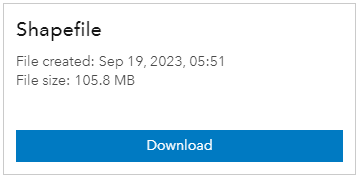
Click Download and (if needed) scroll down and download the “Shapefile” data.
-
A brief summary is provided in the sidebar. While your data is downloading, click on “View Full Details” to read through the metadata provided.
-
Create a working folder on your local computer (you can give it any name) on the Desktop or Documents folder.
Note: throughout this exercise you will save all your data to this folder. When you create the folder, do not include any spaces or special characters in the folder name.
-
Confirm that the data files are stored in 4 folders. The names will correspond to the image below:

-
Leave this folder open.
Note: you downloaded the data files you will need to complete this assignment (these are vector data).
-
Open QGIS (Start (Windows icon)) > QGIS Desktop). This might take a few seconds to load and open or you can open the QGIS folder on your desktop. In this folder, find QGIS Desktop and double-click it to open this program.
-
If it is your first time opening QGIS, you will need to get through some messages/hints by clicking next.
-
-
Navigate QGIS by familiarizing yourself with the various parts of the QGIS browser, hover your mouse over icons to view names of various tools.
Note: Your browser may have different tools than the image below.
-
Layers panel - This is where layers (i.e. imagery, building layers) will be listed. The order of layers in the panel impacts the order of layers in the map - in other words, the layer at the top of the list will appear as the top layer in the map.
-
Toolbars - Most of the tools you will regularly use in QGIS will appear as icons in the toolbars at the top, such as save, zoom, pan. The number of toolbars depends on various features you have activated or installed.
-
Map Canvas - When layers are added to the Layers Panel, they will appear in the map canvas.
-
Menu Bar - Provides access to QGIS functions using standard hierarchical menus.
-
Status Bar - Coordinates, scale, and projection will appear in the Status Bar.
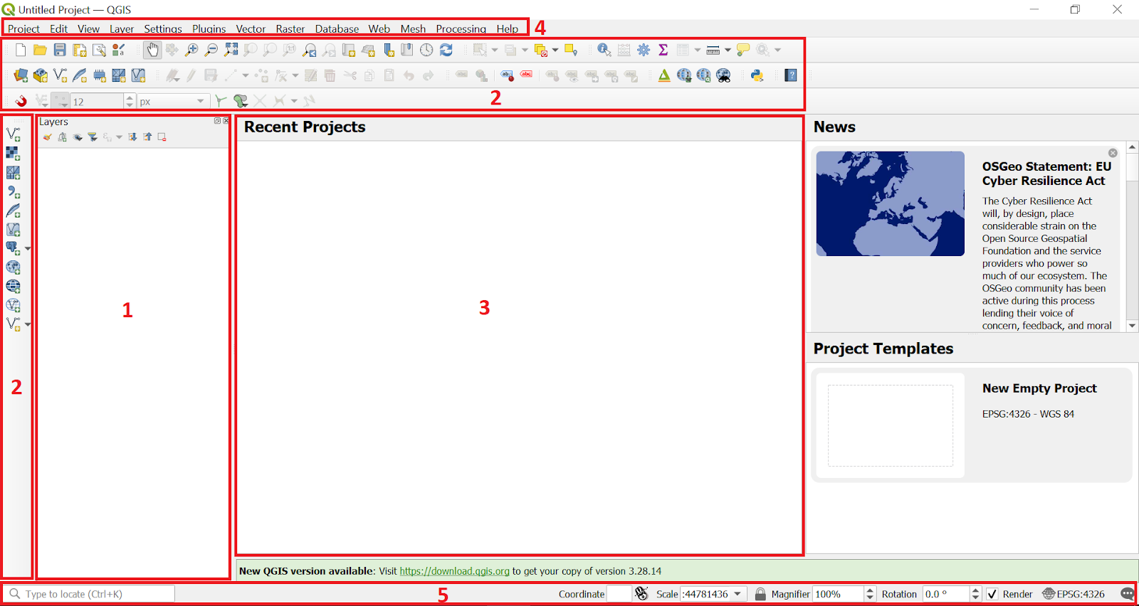
Note: This QGIS graphic user interface (GUI) document explains all the tools that are found on the interface you see when you first open QGIS.
Since the canvas that first opens on QGIS is blank, you are advised to add a basemap (raster data) before adding any other data. This helps you to reference and check that the vector data that will be added are falling on the right coordinates on the map.
1. Adding a Basemap (raster data)
Before adding a basemap, you will need to install the plugin—this allows you to extend the functionality of QGIS—that will give you access to different free, online basemaps to add to your QGIS maps. This plugin is known as QuickMapServices.
Note: Managing and installing plugins requires an internet connection. If the Plugin Manager is not working, check your internet connection. Also, as QuickMapServices provides online basemaps, use of these layers requires a consistent internet connection.
To install this plugin, follow these steps:
- Click on the menu item Plugins ‣ Manage and Install Plugins

- In the Plugin Manager dialog box that opens, click on the search bar and type ‘QuickMapServices’, the plugin will appear in the list.
- Then click the ‘Install Plugin’ button.

- Once installed, QuickMapServices can be accessed on the Menu Bar. Select Web ‣ QuickMapServices
- For more basemaps, including aerial imagery, in the QuickMapServices sub-menu, open ‘Settings’. Click the ‘More Services’ tab. Select ‘Get Contributed Pack’.


- Return to the QuickMapServices sub-menu. There will now be a long list of options for basemaps, including Bing.
In this exercise, we will use OpenStreetMap as our basemap (raster) layer.
- Go to the ‘Menu Bar’, select Web ‣ QuickMapServices ‣ OSM ‣ OSM Standard
- A basemap of the world will open and OSM Standard will be added to your layer panel as a raster
 data layer.

2. Adding vector data
- Hover your mouse over the tools until you find the “Add Vector Layer”
 tool. Click on this icon to open the Add Vector Data dialog.

- Click the 3 dots
 under ‘Source’ and navigate to the location on your computer where you saved the 4 shapefiles that you downloaded and click ‘Open’ (you can select all four layers at once).

- Then click “Add”
- The ‘VGIN_RAIL’ data will give you 3 data to choose from, select the 3rd one “Railroad.shp” and select ‘Add Layers’

- Under ‘Select Transformation for VGIN_RAIL’ select Inverse of Virginia Lambert Conic Conformal + NAD83 to WGS (40) and click “OK”. This will set the dataset’s coordinate reference system (CRS).
- The following data will be added:
- Virginia_Passenger_Rail_Stations
- VGIN_RAIL_Railroad
- VA_Counties-shp
- VA_State_Boundary__Generalized_-shp

Note: the color of datasets on the Map Canvas might differ from what you see on the image above.
- Zoom in and out of your map using the scroll button on your mouse, using two fingers on your touchpad, or right clicking and holding down.
- Drag the layers up or down so that they do not cover each other. You will want the Virginia_Passenger_Rail_Stations to be on top, followed by the VGIN_RAIL_Railroad, and then the VA_Counties-shp, and finally the VA_State_Boundary__Generalized_-shp layer will be at the bottom.
- You can turn layers on and off by checking/unchecking the box next to each name.
Note: Clicking the menus at the top of the screen will show various tools you can use to edit, visualize and analyze your data.
Exploring the Attribute Table
- Right click on each layer and select “Open Attribute Table”. A new window will open that shows the attribute table of the selected layer.
- Every point, line, or polygon file has an attribute table.
- Any data in the attribute table can be used for displaying and labeling on the map and making queries.
- You can also create new columns in the table and add data or calculations.
- Metadata can be key to understanding attribute tables that use codes and abbreviations.
Note: you cannot open an attribute table for a raster data layer because this format represents information as a grid of cells where each cell contains a value representing a certain attribute. Rasters don't have attribute tables in the same way that vector data does.
- On the Menu bar, select ‘Project’ > ‘Save As’.
- Select the folder that you want to save your project in (ideally this will be the folder that you saved your shapefile datasets in.
- Select a name for your QGIS project, for example ‘virginia_railway_system’ and select “Save”.
- Your project will be saved as a ‘.qgz’ file.
- From here on out, you can click ‘Save’ and your project will be saved.
Note: you are advised to save your project after every 10 minutes of working to prevent losing your data in case your project crashes.
Data can be symbolized in a variety of ways, depending on the data format and available attributes.
Changing a Single Symbol
- Right click on the point layer for “Virginia_Passenger_Rail_Stations” and scroll to the bottom to select ‘Properties’.
- A new layer will open (Layer Properties), select “Symbology”
- You can choose any symbol and color that you think best represents train stations (scroll if needed)
- You can make more modifications to the symbol and get additional symbol styles by selecting “Simple Marker”.
- Click the dropdown button under ‘Symbol layer type’ and select SVG Marker. This offers you a more versatile and flexible way to represent point features on your map with custom graphics.
- Scroll down on the ‘SVG Groups’, select ‘transport’ and choose the marker that will best represent a train station from the ‘SVG Images’.
Note: you can also use the search button to search for a specific marker.
- Change the color, size, stroke, etc. for your points until you get a symbol that you think will best represent your layer.
- When you are satisfied with your symbol, click ‘Apply’ then ‘OK’.
4. Do the same for the ‘VGIN_RAIL’ layer, and scroll down (if needed) or select “Simple Marker” searching for the symbol that will best represent your railroads. All the while looking for what will have a good visual appeal to your viewers.
- Click ‘Apply’ then ‘OK’ once you are done.
Note: uncheck the “VA_State_Boundary” layer for now.
5. Open the or the ‘Properties’ for the “VA_Counties” layer. We will make this layer mildly transparent.
- Change the ‘Color’ of the layer if you want and click “Apply” to see the changes.
- To reduce the layer’s transparency, select the “Opacity” and reduce it by 50% for now. Click ‘Apply’ and then ‘OK’ if you are satisfied.
- If you want to make more changes to this layer, click “SImple Fill” and change the values to what will best represent the counties on your map. For example, you can increase the ‘Stroke width’ and see how it looks.
Note: check the “VA_State_Boundary” layer
6. Open the ‘Properties’ for the “VA_State_Boundaries” layer and select “Simple Fill”.
7. Click the dropdown button under ‘Fill color’ and select “Transparent Fill” (you can click ‘Apply’).
8. Increase the ‘Stroke width’ so that the layer will be seen as an outline.
9. You can change the ‘Stroke color’ as well as ‘Stroke style’
- Because this is a boundary, we will make it a ‘Dash Dot Line’
10. Click ‘Apply’ the ‘OK’.
Note: drag the “VA_State Boundary” layer on top of the “VA_Counties” layer so that the state boundary is more visible.
Symbolize Categories
Let us change the color and categorize the counties data according to the their names:
- Open the ‘Properties’ of the “VA_Counties” layer.
- Select the dropdown button under ‘Single Symbol’ and select “Categorized”.
- Under ‘Value’ select “NAME” and click “Classify”. A list of the county names will appear.

4. Click “Apply” and then “OK”. Your map will now have the counties represented by different colors.
Labeling your Map
Now we will add labels on the map so we can easily identify the names of the features on the map. You can do this for either the train stations layer or the counties layer, or both (it is not recommended to label both layers because it will clutter the map).
- Open the ‘Properties’ of the “Virginia_Passenger_Rail_Stations” layer and select “Labels”.
- Click on the dropdown symbol under ‘No Labels’ and select “Single Labels”.
- The ‘Value’ field might automatically select “Station_Na” (these are the station names_. Click ‘Apply’ and see how they appear on the map.

4. If you want to further change the styles on your labels, you can decrease or increase the size, and change the color.
5. You can include a buffer on your labels by clicking ‘Buffer’ and checking the “Draw text buffer” and click ‘Apply’.
6. You can also change the size of the buffer for your text.

7. Save your project.
In order to understand the average values of a property or quantity of an area, you should create a choropleth map which uses differences in shading, coloring, or the placing of symbols within predefined areas. Let us change the color and categorize the counties data according to its population:
- Open the ‘Properties’ of the “VA_Counties” layer.
- In ‘Symbology’ select “Graduated” and under ‘Value’ select “POP2012”.
- You can select the ‘Color ramp’ to symbolize the data in whatever way you think is best. Map symbology can be used to alter the way people view and understand information, just like statistics then click “Classify” at the bottom.
- If you want, change the ‘Values’ that you want to appear on your legend or leave it as is, then click “Apply” and “OK”.

You will notice that the color ramp of your layer shows deeper and lighter shades. This categorization helps you to make an analysis, for example, that most Amtrak train stations in Virginia (points) are found in the more populated areas that have a deeper color shade.
5. Save your map project.
Making Your Map
In this section you are going to create your map that will be exported to become a basemap. A basemap is like the background picture on a map that helps you know where things are. It shows features like roads, rivers, and landmarks, so you can add your own information on top of it, like markers or points of interest.
-
On the Menu bar, clock ‘Project’ and select “New Print Layout”.
-
A small pane will appear where you will enter the title of your layout and a new layout Window will open.
-
On the left panel, click the “Add Map”
icon and draw a box where you would like the map to be placed
-
Drag the corner of the map to fill most of the page but leave room for a title, scale bar, legend, etc.
-
Note: if you need to adjust the scale of your map, do the following:
-
Click the ‘Move item content’
icon and drag your map around, zooming in and out.
-
Another option is to change the scale number under ‘Main properties’ to a scale that works for your map
-
To add a legend to your map, click on the “Add Legend”
icon, and drag in the box big enough to see all of the entries. To edit the wording in your legend, follow these steps:
-
With your legend selected, uncheck “Auto update” to enable you to edit.
-
Double click on each layer and edit the layer names to what you want your viewers to see. Click the back button
after each change to go back to the ‘Legend Item Properties’.
-
To remove a layer that you do not need, for example ‘OSM Standard’, select the layer and click the remove
icon.
-
-
To add the North arrow, select the “Add North Arrow”
icon and drag the box to where you want to put your North Arrow and adjust it accordingly.
Note: you can change the North arrow types by selecting ‘arrow’ under the “SVG Groups” on the right panel
-
To add a scale bar, select the “Add Scale Bar”
icon and drag the box to where you want to place your scale bar. You can adjust the scale properties using the ‘Scalebar’ properties on the right hand side.
-
To add a text on your map, for example the map title, select the “Add Label”
icon and drag the box to where you want to have your map title. To change your text properties, use the ‘Label’ under ‘Main Properties’ on the right hand side of your layout.
- On the menu bar on the top left, click ‘Layout’ and select “Export as Image”.
- Select where you want to save your map on your computer and change the ‘Export options’ if you want then click “Save”.
- Your map might take a minute to save (this depends on how heavy the layers you have in your project are.
- Once done, you can open your image and see how your map looks like.
- To export the map as a PDF, click ‘Layout’ and select “Export as PDF” and select where you want to save your map.
- Change the ‘Export options’ if you want then click “Save”.
- Once done, you can open your PDF and see how your map looks like.